Sometimes with design, as in life, less is more. Minimalism in design is not about removing all elements, it’s about keeping only the elements you need. Sounds easy enough, right?
The human mind aspires to minimalism.
Contrary to popular culture conditioning, our brains are not extraordinary machines with superhuman processing powers. The ease with which our little minds can be overwhelmed by sensory overload is a bit embarrassing, to be honest. The fact is, our minds can’t process information dumps.
We break down the information we receive into smaller pieces, look for patterns and develop associations that help us make sense of the data. If we were to describe minimalism in a short, single sentence, we would say that its design is created with a distinct intention. What is your graphic design work trying to accomplish? What is its singular purpose? What is the point of it?
It forces you to find that purpose of being and challenges you to pare down the design and get rid of all the flashy details until only that purpose remains. But before you confuse minimalism with simplicity, know that minimal design is not naked. It is richer and more meaningful than any other graphic design style.
Simple against minimal 🤷♀️
Minimal design is very utilitarian: we focus only on the essentials and get rid of the fluff. In other words, while minimal design is simple, the goal is not to create simple shapes or obvious designs.
Instead, it can be complex, colorful and full of character.
In other words:
A minimalist design doesn’t have to be colorless – you just have to choose fewer colors.
- It can be complex, but never overwhelming.
- It can abandon flat design, but with a purpose.
- The latter is important to remember.
While the two styles certainly overlap, a minimal design can exist without being flat. It can have shadows, a 3D effect and color gradients.
Your only goal is to use these elements if they are essential to the design.
Like any other type of digital design, minimalism has a few attributes that make it what it is.
It’s light💡
Don’t get bogged down in unnecessary details, minimal design conserves resources and uses only what is necessary.
Think of the Apple logo for a moment.
An organic shape in a single solid color with no font carrying the brand name. With nothing else cluttering the logo, you have the time and focus to appreciate its beauty.
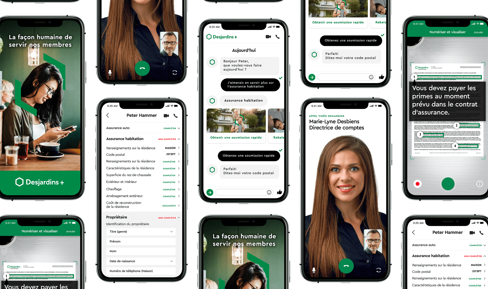
But graphic design is not limited to brand identity work.
So, as a graphic designer, you must follow the rules of minimalism in everything you create. Whether it’s information on your website, copy on your landing page or images in your inventory, you should only use what’s necessary and get rid of clutter.
It’s useful ☝️
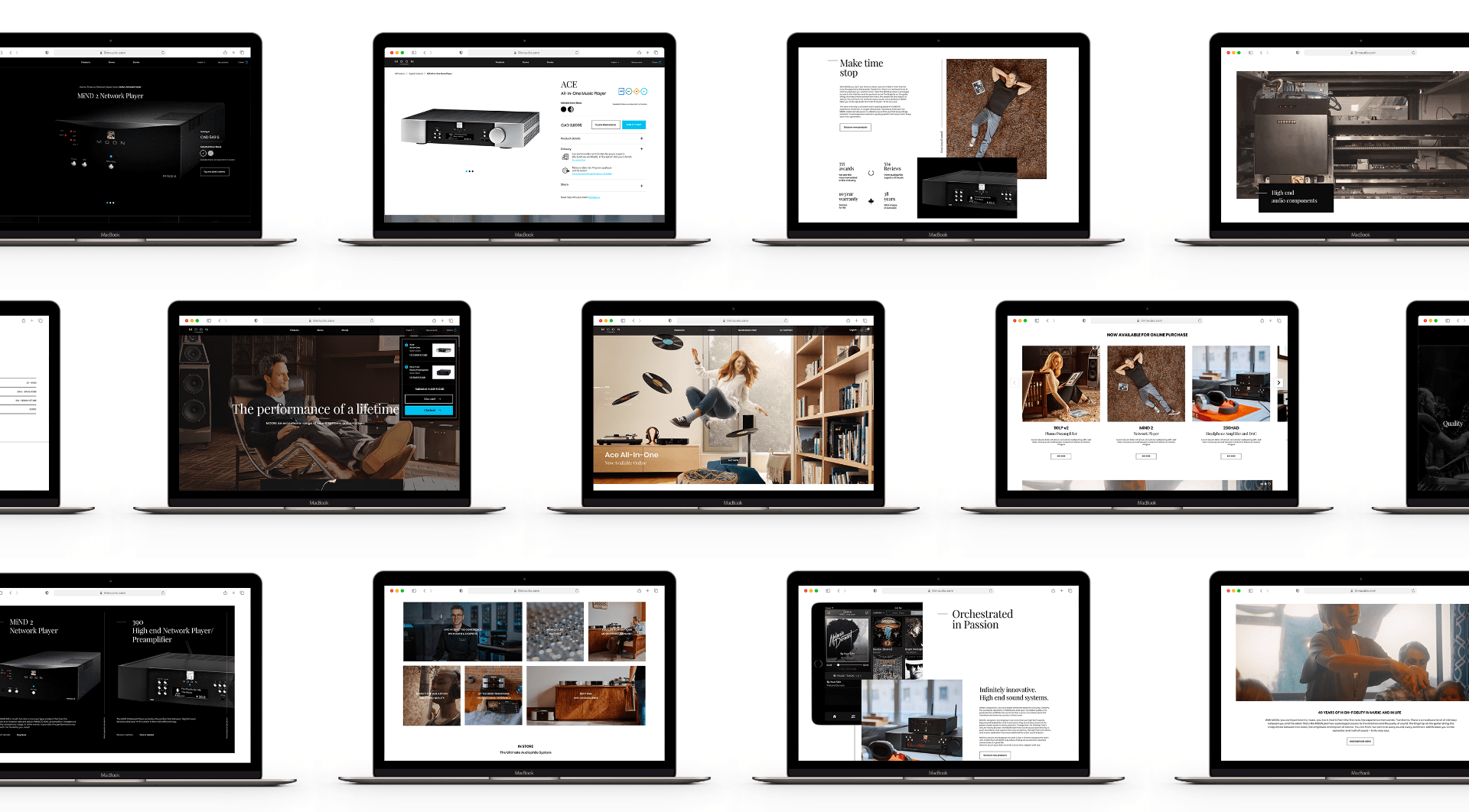
For example, when you look at the landing page below, you immediately see the hero images. Zero things on this page that shouldn’t be there. Each piece of information on the page answers a certain query.
It’s timeless⏳
Good graphic design should be timeless.
You want your brand logo and website design, etc. to remain relevant and understandable when all the latest design fads have passed.
It supports the visual hierarchy🙌
Visual hierarchy is the process of presenting information in order of importance. Minimalist design, being a focused approach, follows the commands of the visual hierarchy to a T.
It ameliorates balance ⚖️
One of the many reasons the human brain is obsessed with minimalism is the way it introduces balance and calm wherever it goes.
Just as you can get sensory overload from too much noise, highly detailed graphic design work can also feel claustrophobic.
There’s space to breath 😮💨
White space and minimalism are interrelated concepts.
While minimalist graphic design focuses on highlighting the hero’s functionality without the distracting details, the use of white space helps bring the hero’s element into even greater focus and devours unnecessary details.
It replaces them with a solid, calm background that further emphasizes the main element.
However, providing support for the hero element is not the only service white space provides. It is also used to amplify the brand message and design intent by creatively enhancing the surrounding space.